Last updated: 16/09/2015
Please refer to How to create page layouts.
Modules are styled containers for content, they can be used within a homepage grid, right hand column or within body area of a page.
When using a right column, content will almost always be within modules.
You can use modules to:
A module is usually made up of a heading, an image, short paragraph (20-30 words), blockquote or unordered list. Where possible, the heading should be made into a link to the relevant page.
Use <div class="module"> to create a basic module.
Module paragraph text with an inline link to same page that module heading and image link to.
Module paragraph text with an inline link to same page that module heading and image link to.
Use <div class="module module-box"> to create a module box. This will add the stone-coloured background from the University's core colour palette.
Get a taste of the accommodation on offer for undergraduates - from modern catered halls to shared Georgian townhouses.
Get a taste of the accommodation on offer for undergraduates - from modern catered halls to shared Georgian townhouses.
Use <div class="module module-box module-b-blue"> to replace the stone background with one of the 16 colours from the University’s supporting colour palette - in this case bright blue.
Get a taste of the accommodation on offer for undergraduates - from modern catered halls to shared Georgian townhouses.
Get a taste of the accommodation on offer for undergraduates - from modern catered halls to shared Georgian townhouses.
The 16 colour classes are:
module-box-d-aquamodule-box-d-bluemodule-box-d-purplemodule-box-d-pinkmodule-box-d-redmodule-box-d-yellowmodule-box-d-limemodule-box-d-greenmodule-box-b-aquamodule-box-b-bluemodule-box-b-purplemodule-box-b-pinkmodule-box-b-redmodule-box-b-yellowmodule-box-b-limemodule-box-b-greenUse <div class="module module-box module-tint-b-purple"> to replace the stone background with one of the eight tinted colours from the University’s supporting colour palette - in this case tinted bright purple. Note, only bright colours have a tinted version.
Get a taste of the accommodation on offer for undergraduates - from modern catered halls to shared Georgian townhouses.
The eight tinted colour classes are:
module-box-tint-b-aquamodule-box-tint-b-bluemodule-box-tint-b-purplemodule-box-tint-b-pinkmodule-box-tint-b-redmodule-box-tint-b-yellowmodule-box-tint-b-limemodule-box-tint-b-greenYou can pair two partner-coloured modules by nesting one within the other. The two colours must be partners from the supporting palette, in this case dark pink and bright pink.
Results are from the most recent Research Excellence Framework 2014, conducted by HEFCE.
Use <div class="module module-message icon-info"> for important messages and alerts.
This type of module can be used across the full width of the page or within a column grid_8.
You can also use module-message with one of the eight tinted colour classes. Note, only bright colours have a tinted version.
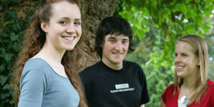
Modules usually have an image. When used, the image is wrapped within the heading tags, after the heading text.
There are two images sizes:
Use 283px × 142px for the first module image in a right hand column. If further modules are used in the right column, images should usually be 283px × 94px.
See how to prepare images for use on web pages.
If you want a module with just a linked heading and image, use <div class="module module-box module-box-d-green module-just-image">
Keep paragraphs in modules short and succinct - 20-30 words is usually enough. Do not use a 'Find out more' type link at the end of the text, instead link relevant words/phrases within the paragraph.
Module paragraph text with an inline link to same page that module heading and image link to, and a link to another page.
To create a list menu of links use:
<ul class="list-no-style list-links list-links-no-margin"> for modules with images<ul class="list-no-style list-links"> for modules without imagesModules can be used without headings. Useful for a fact, blockquote or profile.
To create the example with the circular thumbnail image, the image must be 142px x 142px. Insert the image to the left of the first word in the paragraph, then right-click the image and select 'Edit Media Attributes' and in the 'class' field add img-circle img-circle-right.
The city centre has been designated a centre of culture and a science city by the government.
Bristol is such a good city for students; whether you want culture, good nightlife, shopping, green space or fine dining, Bristol has it all. The university is world-renowned, and to study here is such a privilege.
Zoe, Second Year, MB ChB Medicine
The sports facilities at Bristol are extensive, and you can play pretty much any sport you can think of. There are loads of things to try, and you might enjoy doing something you never thought you’d do.
Oliver, Second year, MSci Chemistry
Modules are mostly used in the right-hand column, but you can add use them in the main body text by adding align-right to the class.
One of the most dynamic and cosmopolitan centres outside London.
Named Source
When you choose a university, you're also choosing the place that will be your new home, so it's worth getting it right.
Our students always say how much they love the city of Bristol - from its friendly people and fantastic music scene to its vibrant Harbourside, green spaces and buzzing centre.
Bristol is a thousand years old but right at the cutting edge. It is dynamic yet laid-back, culturally rich but down to earth.
Best of all, Bristol is the perfect size, offering all the excitement of a big city packed into an area you can easily explore.

Social media modules
A module box for highlighting a Facebook or Twitter account. These are used with one of the eight tinted colour classes - change the
module-box-tint-b-redclass to suit your colour scheme.Follow on Facebook
Follow us on Facebook for the latest news and events.
Follow on Twitter
Follow us on Twitter for the latest news and events.